Cut N’ Mix explores the work of artists experimenting with collage and collage techniques in ways that expand the gestures of cutting paper and mixing various mediums together. It takes as its point of departure some of the concepts from Dick Hebdidge’s series of essays collectively titled Cut N Mix: Culture, Identity and Caribbean Music, published in 1980. In this text, Hebdidge explored the variations of Caribbean reggae and dancehall and other related styles of music as emblematic markers of Caribbean ideas of nationhood, belonging, and the making of culture.The artists included in the exhibition range from established artists who are veterans of collage to new generations of artists experimenting with this malleable medium.
Participating Artists: Elia Alba, Jesse Amado, Blanka Amezkua, Javier Barrera, Maria Berrio, Cecilia Biagini, Michael Paul Britto, José Camacho, Karlos Carcamo, Nat Castañeda, Gaby Collins-Fernandez, Matias Cuevas, Rafael Ferrer, Roger Gaitan, Carolina Gomez, Javier Ramirez/NADIE, Carlos Gutierrez Solana, Hector Madera, Glendalys Medina, Alex Nuñez, Catalina Parra, Carlos Rigau, Hernan Rivera Luque, Linda Vallejo, Rafael Vega and Eduardo Velázquez.
Cut N’ Mix: Contemporary Collage will be on display from July 22, 2015 – October 17, 2015. For more information check out http://www.elmuseo.org/cut-n-mix/.
One of my favorite childhood fables was the story of Henny Penny. What always stuck with me was the repeated use of the phrase, “The sky is falling.” It was the first time I was ever confronted with a tale that dealt with hysteria. How could I had known that one day I would feel driven to scream those exact words, but when I saw the twin towers ablaze and the mayhem that was unfolding in real time as we helplessly watch on TV, I felt like that manic chicken wrought with panic and fear. September 11, 2001 is a mental scar I’ll always carry with me.
As intense as the memories are of that day, I can scarcely remember any color with the exception being the perfect blue sky that offered the delusion that nothing that terrible could befall us. What I remember most are the feelings that coursed through me at rates so fast I could barely record them, terror firmly placing a grip around my neck, anxiety tapping Morse code up and down my arms, disorientation mushrooming in my brain and grief taking possession of my heart. I returned home from my job, where we had to evacuate because of a bomb threat, turned on my TV and laid down on my bed to hear the sounds of faint whistles from dying firemen. I felt absolutely defeated.
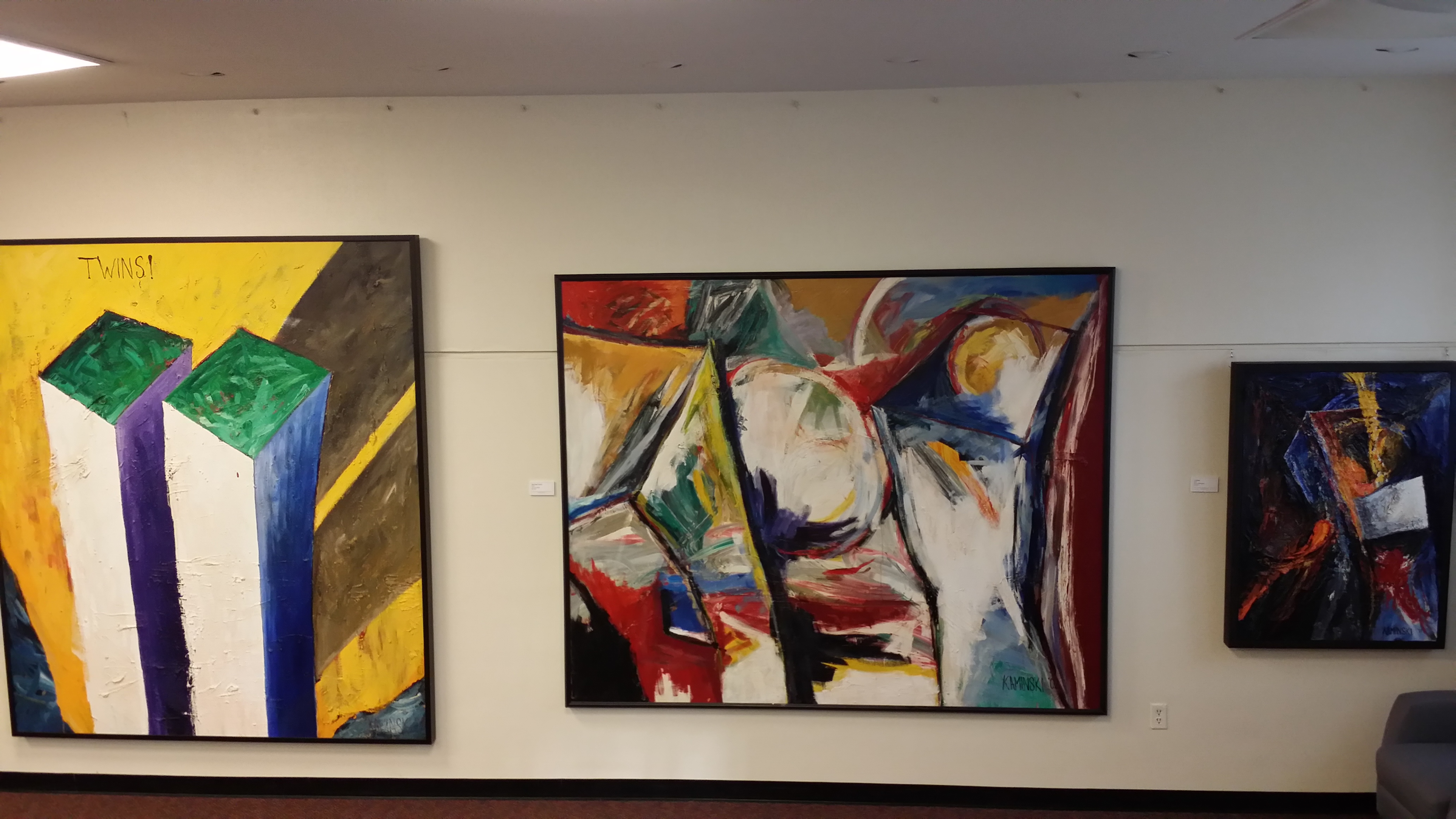
The tragedy of 9/11 left this country reeling and sent us all on our own journeys as we tried to reconcile what happened. Ken Kaminski’s journey took him to the canvas creating a series of work that spans well over a decade. Using the template of abstract expressionists like Willem de Kooning, Jackson Pollock and Emerson Woefler, Kaminski has attempted to record the events and emotions of that day as well as the recovery period that continues to shape us. His efforts also allow those who are too young to remember 9/11 the ability to witness the emotion of that day.
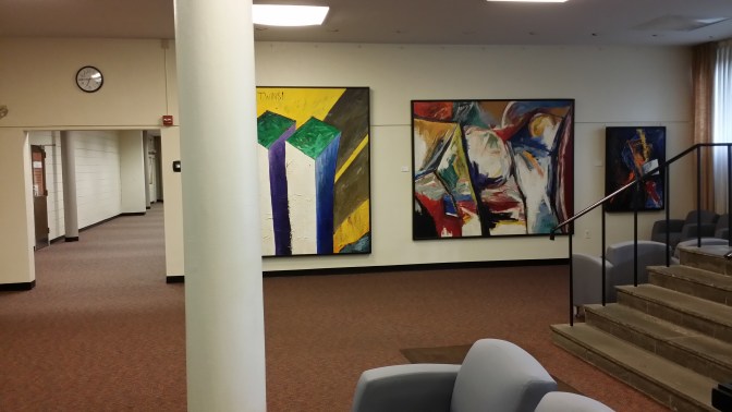
FAMERS I am here to report that his endeavors are wildly successful. I had the pleasure of viewing a few of Kaminski’s 9/11 paintings at the Edward Williams Gallery, located at Fairleigh Dickinson University’s Hackensack campus. The exhibit includes eight selected works that brilliantly convey the events of that day brightly expressed in various hues. The exhibit begins with Blue Sky Day – triptych. This three panel painting brings you face to face with speed of these flying bombs and the majestic sky that it corrupted. With each panel the viewer sees the countdown of the planes getting closer and closer until it hits making its bloody and destructive impact.
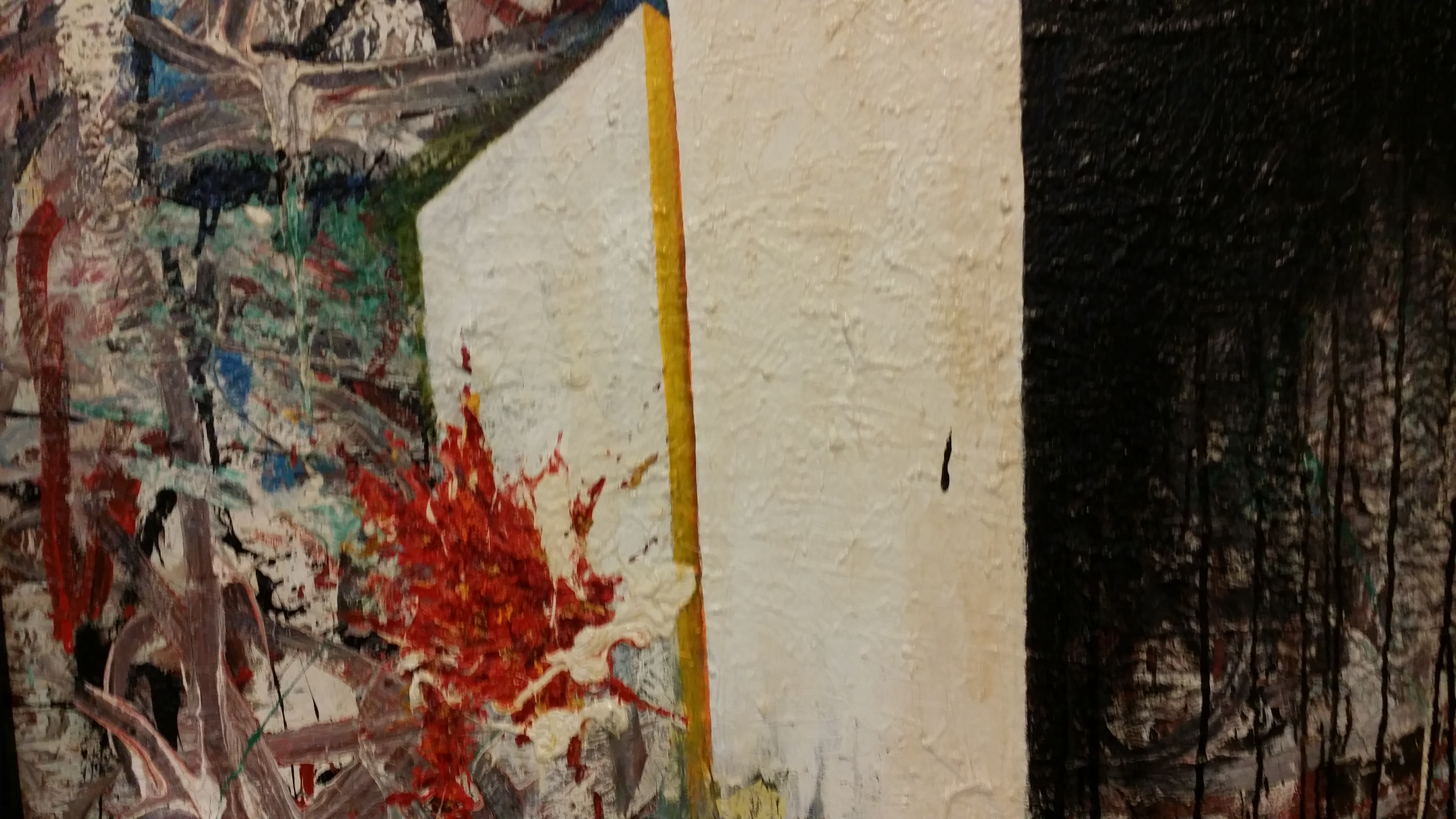
911 The Moment It Happened is an eerie mix of color. The space surrounding The World Center no longer is colored in blue like the atmosphere painted in Blue Sky Day, instead the blue is muddled with streaks of different colors showing the chaos that followed the impact of the first plane, represented in an explosion of oranges and reds bursting from the side of the tower. Streams of black cover one of the towers like a foreshadowing of despair to come.
Blindsided shows the line of fire going straight into one of the towers then blasting out of the other side. Crippled from the blow, the tower bends and the pain is obvious. All that is missing is the scream, but if you remember the sound of the planes hitting the towers, then this painting will ensure that the awful roar of the plane echoes in your ears. Blindsided is an acute observation of a drive-by.
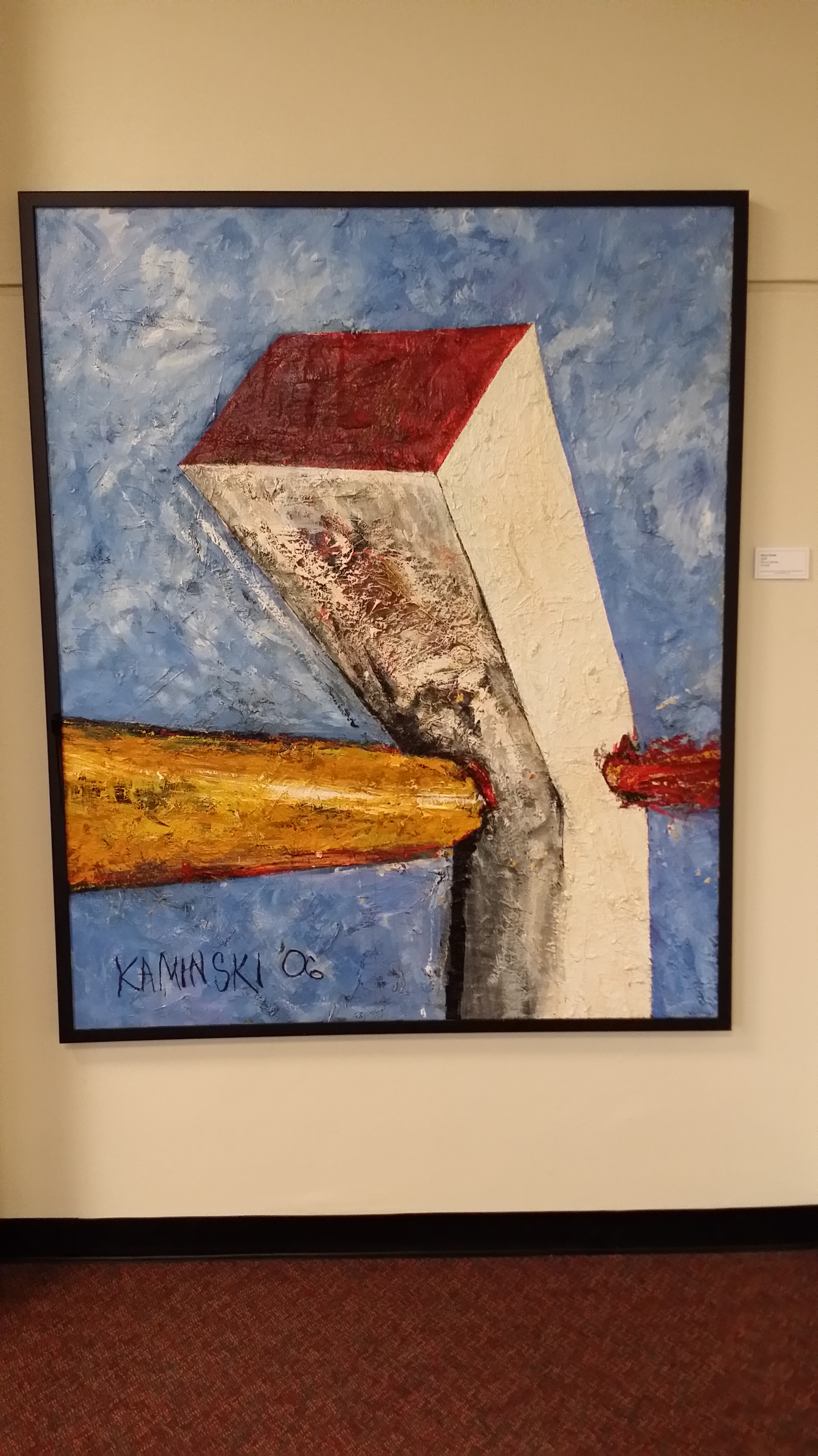
Twins! is a stoic, almost haunting, vision of The World Trade Center towers before 8:46 a.m. September 11, 2001. They were proud and victorious, a symbol of might and power. They represented everything that was great about The Big Apple. In Kaminski’s painting they appeared alive and vibrant again instead of frozen as they are in photographs. The yellow background also contributes to the energy of the piece. It makes you long for the nostalgia of what used to be. If this painting were a song, it would be called The Way We Were.
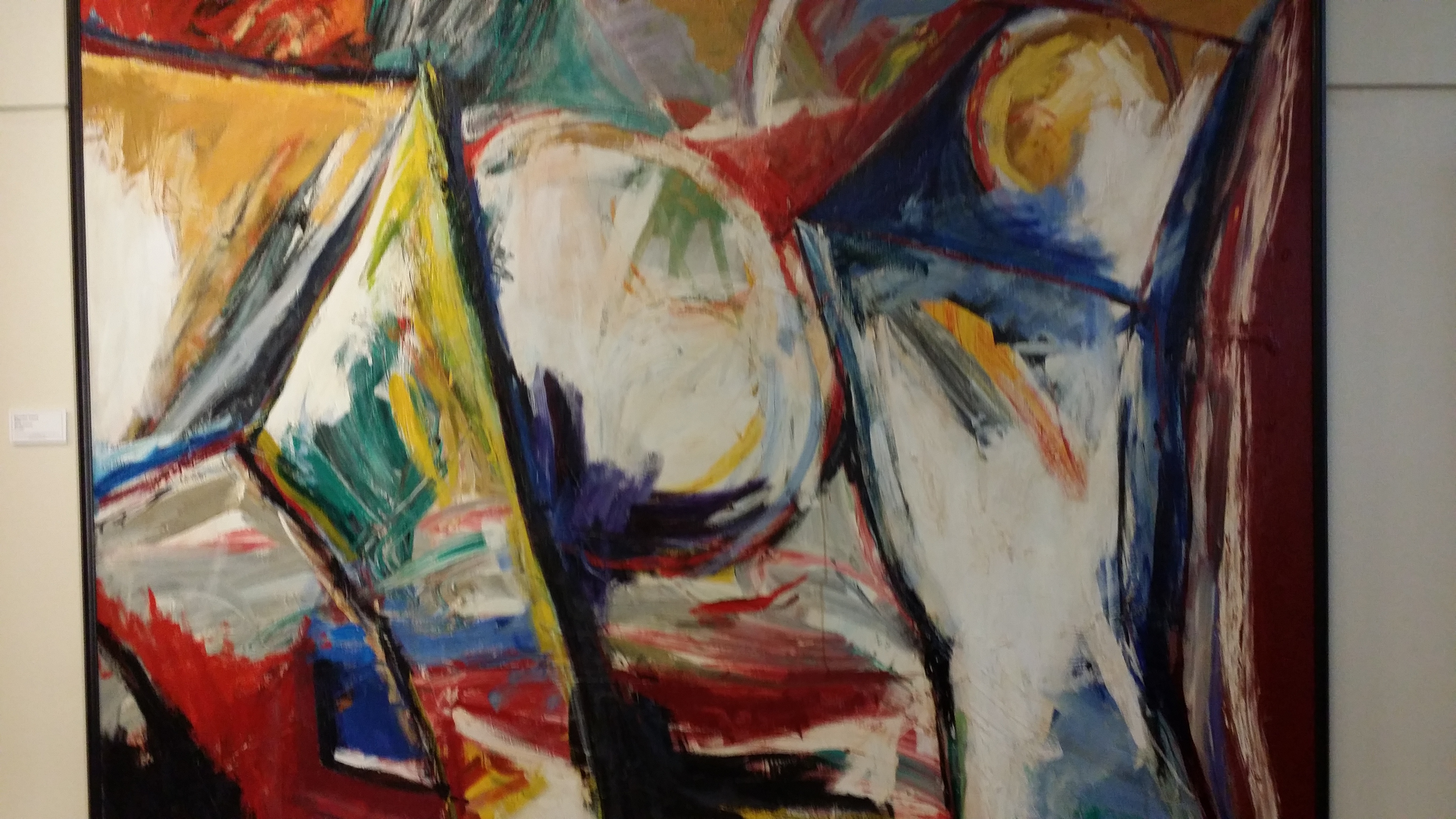
Wounded Towers is a kaleidoscope of disorder. The colors vividly capture the confusion permeating the area as people scrambled for safety and the bent, smoldering towers desperately tried to remain the symbols of glory that they once were, a last valiant effort before they ultimately disintegrated into dust.
Collapse is engulfed in a blending of hues that bring chills to the spine. The voices of those who were lost don’t just whisper, they shriek. It shows the true potential of visual art. There are no words necessary, this painting is one of the most telling portraits of pain and suffering that I’ve ever saw. If someone wanted to understand the mood of the country when the tragedy of 9/11 occurred, all they would have to do is view this painting.
Considering this year will mark the 13th anniversary of 9/11, I believe Kaminski’s exhibit couldn’t visit the New York metropolitan area at a better time. It allows another way for us to remember and venerate a day that will forever be a part of our history. Kaminski’s work carries with it a raw, emotional ambiance. It pulls you in. No matter how hard the visuals may be to look at, Kaminski’s work burst past your pupils and forces you to deal with whatever memories or residual feelings you may have buried. For as much as Kaminski’s work is steeped in tragedy, it is also immersed in the resilience of the city of New York and its people. Yes, the sky did fall, but we didn’t get mired in the pain. We stood atop the ashes; we rebuilt and honored those we lost. The 9/11 paintings are not only powerful and healing; they are a testament that when an artist creates from his or her soul the work that is generated is timeless.
To learn more about Ken Kaminski and view more of his work check out, http://www.kenkaminski.com/. Kaminski’s 9/11 Paintings will be on display at the Edward Williams Gallery, located at 150 Kotte Place, Hackensack NJ, until 9/26/14. Gallery hours are 8:30 a.m. to 8:30 p.m. Monday through Friday and 9:30 a.m. to 2:30 p.m. on Saturdays.
“We were born in Culêtre, a tiny village in Burgundy [France], after a long gestation of 24 months before finally materializing. Our creator, VeroDalla, wanted to make a universal figure devoid of external traits and far removed from pre-existing creatures – we needed our own identity…” says VeroDalla’s website.
Jadot’s alias, “VeroDalla,” is supposed to be free from language barriers. Let’s not get into linguistics, but our Asian and Arabic speaking friends might disagree.
Unfortunately the exhibition feels too gimmicky and contrived. The fact that there is a copyright symbol in the name is a big turn off. It indicates that these sculptures were created with the intention to make money not art. Jadot comes from big money, like big big money. Her grandfather was the founder of Maison Louis Jadot, an extremely successful French wine company. There is a term in the art world, “Housewife art,” and this is what the exhibition feels like. There was no technique to the painting and no real detailing on the sculptures. The colors used were plain, illogical and lacked feeling.
Also crammed in the gallery (which looked like it was half under construction) are two other exhibits by Jadot titled Poppy and Inner Journey. Again, both lacking any kind of skill or technique. The Poppy paintings and sculptures look like cake decoration and Inner Journey is supposed to represent “wet clothing stuck to your skin in summertime.” Ummm…who exactly likes having wet clothes stuck to their skin? Now just because someone comes from money does not mean they cannot be talented, but this is New York and we know how to smell a rat.
Check it out and share your thoughts; Gallery 32 Fine Arts is located at 515 West 20th Street, Level 5, New York, NY. The Jadot exhibition runs from June 13th – June 16th, 2013 so there is still one more day to view the exhibit.
I’ve always had an affinity for artists who use nature as the subject for their work. After all, the relationship between man and nature is a constant balancing act just as nature invariably teeters between the physical and mystical. If an artist can achieve an accord between these two properties as well as Kathleen Elliot, then they are worthy of acclaim. On May 3, Elliot’s nationwide tour of Imaginary Botanicals landed in Manhattan, taking residency at the Tenri Cultural Institute. Using flamework glass to create sculptures, Elliot manufactures pieces that harmoniously merge the delicate, elegant and resolute beauty of nature.
With Imaginary Botanicals, Elliot infuses human elements into plants turning them into abstract narratives about the symbiotic relationship between man and the environment. Other more literal interpretations of plant life are equally striking. In addition to her exploration of plants and man, Elliot showcases another aspect concerning the continuity of humans and nature with “Questionable Foods”, two sculptures that combine Elliot’s intricate glasswork with stitched logos of food brands fashioned to look like fruit growing from branches. These pieces make the viewer ponder how our choice of food, and food brands in particular, affects Mother Nature. Powerful, yet refined Elliot’s statement about the way in which corporations sometimes shirk their responsibility to the planet comes across as subtle as a tap on the shoulder.
The pieces that resonated with me the most were “Offerings”, glasswork pieces displayed in three palms made of wood and plaster. The appearance of the open palms extending through the walls to humbly hold the glass pieces raised them to a spiritual plane and really highlighted the 3D aspect of the entire exhibit.
Seemingly fragile and muted, the exquisite glassworks of Imaginary Botanicals explode with a soulful presence that fills the Tenri Cultural Institute and vibrates with the same dynamism as a drive through Central Park in the spring. Imaginary Botanicals will be in full bloom at Tenri Cultural Institute until May 25 and definitely shouldn’t be missed.
To learn more about Kathleen Elliot, check out this video.
In Manhattan or anywhere in the tri-state area – where the words hustle and bustle are placed somewhere in our daily mantra– the opportunity to observe nature is usually far and few between. Everyone knows the idiom, “Can’t see the woods for the trees.” But in the case of Mary Hrbacek, she sees the trees, the woods and the world that exists within.
I first met Hrbacek during a dinner with respected art advisor Katharine T. Carter. The description of her work fascinated me. Recently I visited Hrbacek’s studio in Harlem to view her art and was pleasantly surprised to find that she is not only an artist, but a curator of nature.
Hrbacek uses trunks, leaves and branches to compose work that exposes the symbiotic relationship that exists between man and the habitat in which we live in. Before my visit, I viewed some of her art online and found it to be interesting, but in-person Hrbacek’s work became animated silhouettes – characters anxious to take their cue onto the proverbial stage of life.
Indeed everyone and everything has a story to tell. Found in Brooklyn, Central Park, Vermont and other places Hrbacek has traveled, the trees selected in her pieces reach far beyond the simplistic, obtuse approach to featuring nature in art. Hrbacek’s work causes the viewer to pause. She pulls the soul out of something thought to be void of one and supplies it with a voice. No longer to be ogled just for the ability to provide shade or admired for their stature or splendor during the changing of the seasons, these trees revealed the delicate dichotomy between masculine and feminine properties.
Virility, frailty, strength, sensuality are all themes that resonate throughout Hrbacek’s work. Through a series of bold, contrasting color selections, Hrbacek’s trees express hope and loss, desire and aversion and all that is ephemeral and divine between the relationship that man has with the universe as well as with members of the opposite sex. Hrbacek’s work presents a pensive look at questions and situations that have reappearing in the telling of man’s history since the days of cavemen. Through these nameless and faceless subjects, we learn more about ourselves.
The Tuesday after Superstorm Sandy I ventured out my home to discover dozens of trees lying in the middle of roads and resting on the roofs of houses and cars. Nature’s fury uprooted them from the earth and took blocks of concrete with them. In that moment, I again realized that nature and art, in one way or another, are always trying to tell us something , and this revelation made my recent visit to Mary Hrbacek’s studio all the more poignant.
Photos: Courtesy of Mary Hrbacek and F.A.M.E NYC Editor
The Temptations proclaimed, “Poppa was a rolling stone.” Blues maestro Muddy Waters told folks that he was a rollin’ stone. But little did he know when he recorded that tune for Chess Records in 1950 that the title would be the moniker for one of the most iconic and successful groups of the 20th century. Known as the first bad boys of rock ‘n roll and complete with a “g” on the end, The Rolling Stones formed in 1962 when then guitarist and founding member the late Brian Jones christened the name while setting up a gig. Little did he, Mick Jagger, Keith Richards, Charlie Watts, Bill Wyman or Ian Stewart know that they would help to cement the British Invasion of the 60s as well as become some of the architects of rock ‘n roll.
Fifty years later, amid a few changes in bandmates, The Rolling Stones are just as relevant and popular as they ever were. And as the band and their throngs of fans worldwide commemorate the legacy of music The Rolling Stones has created, it was Porter Contemporary that had me in its sway. Last Thursday the gallery gave its own homage to the group that ranked number 10 on Billboard’s Hot 100 Top All-Time Artists when it debuted, A Rolling Stone. The exhibition is not only a celebration for the 50th anniversary of The Rolling Stones, it also inspired by the proverb, “A rolling stone gathers no moss,” (a sentiment that perfectly exemplifies the career and members of The Rolling Stones). Displayed in A Rolling Stone are the works of Jason Bryant, Jennifer Murray, Johnny Romeo, Adam Normandin, JaH-HaHa and Naoto Hattori. The show is concise and cohesive; the 10 pieces selected for the exhibit are a beautiful representation of the individual artists’ style as well as the theme of the show. JaH-HaHa’s paintings feature a young Mick Jagger and Keith Richards atop sheets of music. Jason Bryant created works based on The Rolling Stones’ iconic album Sticky Fingers, while Jennifer Murray’s work showcased the proverb.
The merging of music and art has always been a particular source of inspiration and enjoyment for me. Wild horses couldn’t drag me away from seeing this exhibit, considering that I’m a huge admirer of The Stones. Well curated, reflections of each member’s personality are inherent throughout the space. But out of all the members, A Rolling Stone reminds me most of Charlie Watts, understated but with a driving back beat that is intrinsic and entrancing, A Rolling Stone will be on exhibit until May 26. I recommend going to see it; I guarantee you will leave satisfied.
Formerly Raandesk Gallery, Porter Contemporary is located in Chelsea section of the Village at 548 West 28th Street and is open Wednesdays 11 a.m. to 6 p.m., Thursdays 11 a.m. to 8 p.m. and Fridays and Saturdays 11 a.m. to 6 p.m.
Everyone has heard the idiom that the body is a vessel, so how ingenious was it of Jee Hwang to use one of the most intimate objects in one’s home to express that sentiment. Desiring Uncertainty is a collection of paintings currently showing at Porter Contemporary, located at 548 West 28th Street. The show opened February 23; last Thursday Porter Contemporary hosted an artist talk with Jee Hwang so viewers could hear firsthand what inspired her to create these works.
Jee Hwang used a series of bathtubs as well as a crate; bag and even herself face down in a bed of grass to express desire, and its relationship to the state of presence and absence. A bath at the end of the day seems to be the cure all for the world’s ills. We draw a bath, soak, relax, wash away insecurities and pressures and utilize the water to restore us. Then we release the water and do the same thing the next day. While walking through the exhibit, I could feel the longing, the languishing for something to happen, but what that something is hasn’t been discovered. The vivid detail of Hwang’s works made these cold, stationary items pop with verve, becoming stimulating to look at. It is amazing how the bathtubs express the essence of desire as well as the loneliness that can come with unrequited desire and the changes that it can take over time. I found her works to be remarkably introspective and alluring.
Artist Jee Hwang was born and raised in Seoul, South Korea, before migrating to Maryland in 2003. She graduated from Pratt Institute with a MFA degree in 2009 and received a partial scholarship to the Vermont studio program in 2010. Her first solo show was at A.I.R. Gallery as the 2009-2010 A.I.R. Emma Bee Bernstein Fellowship Artist. Desiring Uncertainty will be on exhibition at Porter Contemporary until March 31. If you can, I highly suggest taking a peek before it ends.
As a small girl I kept my face in books (perhaps that is why I am writer today). Reading to my mother while she made dinner was one of my favorite pastimes. The XX chromosome dictated my reading selection and I always seemed to fancy tales that were epic in scale, took place in a land far away and had at least one damsel in distress. Not only did the words enrapture me, but the illustrations kept me fascinated as well. In the myths and fairytales I read as a child, the wolf always played an essential role. In Little Red Riding Hood the wolf was a cross dresser that had such an obsession with the girl in the crimson cloak that he slaughtered her grandmother and pretended to be her in an effort to get close to his target. In ancient mythology, a she-wolf suckled twins Romulus and Remus. Her milk-filled tits fed the starving babies that were abandoned and left to die. She was their first foster mother, and as men the twins would become known as the founding fathers of Rome.
Jennifer Murray has her own story with the she-wolf. As we stood in front of one her creations last Thursday, she revealed to me the catalyst that manifested into the furry siren. While in college, Jennifer was experiencing circumstances that required a Waiting to Exhale moment. When she finally had the opportunity to release, a wolf was delivered. Further developing the seed that had been planted long ago, Jennifer brings the mysticism and allure of the she-wolf and cougar that has been skulking in our social conscious to the surface in Displaced Fables/Damaged Dreams, her first solo exhibition. Displaced Fables/Damaged Dreams is an imaginative exploration of the female mystique and its multiple perceptions. Using charcoal sketches on stretched paper, mixed media canvases and hanging installations, Jennifer balances the fierceness, femininity and fragility of these creatures with great detail and perfect symmetry. With baroque fabrics, flowery patterns, wallpaper with foliage and yarn she literally weaves a tapestry of visual anecdotes that create a new vocabulary for women.
With “The Queen/Bitch Diptych” Jennifer presents the face of two she-wolves, their necks surrounded with fabric like a Medici collar. The canine lassies hang side by side one looking stoic and magnanimous, the other is tempestuous with snarling fangs. “White Drawing I” displays a she-wolf haphazardly suspended in white sheets, perhaps the colorless cloth is preventing her from moving or could be removing her from a perilous encounter, thereby becoming her saving grace. “Decoy Triptych” depicts a wolf straddling a sheep and a sheep mounting a wolf cleverly exposing the facades we flaunt when hiding our true selves. What I found particularly interesting about this piece were the beleaguered expressions of the mounted animals, they reflect the burden of constantly having to carry a disguise.
I first became acquainted with Jennifer Murray and her work at the last year’s Affordable Art Fair. Upon first glance I knew I would like to see more of her creations. In total, I was extremely impressed with Jennifer’s initial introduction to the New York City art scene. Displaced Fables/Damaged Dreams achieved its goals in positioning the viewer in fragmented narratives and dreamlike visions allowing us to decipher how textile flying machines, birds, wolves and cougars related to our human experience. As I toured the exhibit, I kept returning to “Spiker,” a drawing of a cougar with bold material covering her back. She was crouched, her front paws resembling a pouncing stance. Her eyes were sexy, determined and primal. Looking at this totemic symbol of womanhood I was reminded that within me and every woman there is a little girl playing dress up, a battle-axe ready to strike, a wolf ready to howl at the moon and an empress ready rule. The trick is harmonizing these characters in the story of our lives as effortlessly as Jennifer composed the scenes of this exhibit.
Displaced Fables/Damaged Dreams will be on display at Raandesk Gallery, located on 16 W. 23rd Street until March 5.
The first time I met Skot Foreman was during a Purvis Young exhibit at Gallery Bar in 2008. I was pulled in Purvis’ world of struggle and redemption. I spoke with Skot briefly that evening and left thinking how Purvis Young had a real champion in Skot Foreman; he was someone that would fight to ensure the legacy of this artist (who was in failing health) would be properly maintained and not exploited. But as I got to know Skot I came to the conclusion that it was not just Purvis that made him zealous. Skot Foreman is passionate about three things: his two dogs Cassie and Reva and art. Another thing I learned after getting to know him over the past two years is that Skot is a rebel.
Unlike the famed General Sherman, Skot made his march in reverse conquering one city at a time. He opened Skot Foreman Fine Art in 1994 using various locations within the greater Miami area. In 2001, he moved to Atlanta opening up a space in Castleberry Hill, the city’s gallery district. Skot moved to Manhattan in 2004 and opened a gallery first on the upper eastside. Currently, he is settled in Tribeca. “I always had a connection to New York,” he states. He admits that his journey to “the hub of the international art market” was one filled with baby steps. Originally wanting to migrate to New York after 9/11, Skot re-thought the notion and moved three years later. “I have always been one to swim upstream,” he states. Skot called his initial move to the upper eastside “strategic,” and feels that living downtown is more indicative to his personality. “It’s more creative and laid back…more on the DL,” he says, “There is a new discovery around every corner.”
One of those discoveries happened to be situated underneath Skot’s Tribeca home and would eventually lead to an innovative union between Skot Foreman Fine Art and fashion brand Grown and Sewn. Skot was introduced to Grown and Sewn’s founder and head designer Rob Magness through Rob’s wife Sara, an award- winning interior designer. Over a glass of wine they discussed the space that would become Grown and Sewn’s home, 184 Duane Street. Both had the desire to use the space for their creative endeavors and Sara suggested collaborating. “Rob and I looked at each other and you could see the light going off in one another’s head,” he says. Skot believes the synergy between he and Rob created magic. “The word that keeps coming back to me is authentic because so many people that do walk in the space seem to respond to the fact that we’ve combined art and craft, which is truly a human thing but I think it’s probably been lost through the later half of the twentieth century and we wanted to rediscover that.”
Skot Foreman Fine Art amasses contemporary art of the 20th and 21st centuries and features the works of prominent artists such as Pablo Picasso, Henri Matisse, Purvis Young, Keith Haring, M.C. Escher and many others. “I try not to show artists that are the flavor of the day,” he asserts, “I try to show artists that have stood the test of time. It starts with a chord that artist may have struck with me so it’s hard to remove any personal bias because if I don’t believe in it, if I don’t have conviction, then how can I share it with a friend or turn a collector on if I’m not passionately behind the work.” Skot believes his penchant for pop art stems from his surroundings growing up in Florida and recalls being cognizant of signs, billboards and other media. He also has a deep appreciation for artists that can take a sheet of paper and illustrate. “I’m a little bit old fashioned in that regard,” he shares, “I like [artists] who have got some chops, knows how to draw, came up through the ranks and paid their dues.”
Skot understands that artists are the visionaries of their times, no matter what genre one may choose t, which brings me full circle to how Skot and I met: a showing of Purvis Young’s work. Skot loves to “turn people on” to his work. He describes Purvis’ art as shamanistic; indeed there is an other-worldly aesthetic to his pieces. Skot and Purvis (who died in April) shared a friendship that spanned over 20 years. One of Skot’s favorite stories about Purvis Young involves another shaman of sorts, the late rapper Tupac Shakur. “I sent Tupac a portfolio of Purvis’ work to look at. I wasn’t there; it was through a third party. Tupac opens it up, starts looking at it, eyes start bugging, closes the portfolio up and says, this shit is fucking dope,” he recalls as we both begin to laugh. It is no surprise to me that kismet made Skot Foreman one of the preeminent collectors of Purvis Young’s work. Besides both men being Floridians, Purvis’ work projects a naked genuineness that obviously comes from within. It is that same frank verisimilitude that resonates from Skot’s demeanor and is the reason why they were kindred entities.
When it comes to the art that has been reflected during first decade of this millennium, Skot discloses that he has not been a fan of the new conceptual, instillation media that is meaningless but relies on the story behind it or the process of creation to hold its validity. He is not concerned with the back-story of a work of art, and would like to see a renaissance of the fundamentals of drawing and painting develop. “Everything is so media or marketing driven, and I think that’s probably why one day there is going to be a return back towards things that are authentic and accessible. Things that are real. People can see through all the smoke and mirrors.”
A journey begins with a single step. When someone steps passes through the threshold of Raandesk Gallery to view the exhibition of South Korean artist Jihay Kang’s A Single Journey, the caravan one embarks on is one of canvases bursting with prisms of color.
Jihay Kang’s artwork is a potent concoction of materialism and subtle statements in bold multi-hues. Her use of color is the catalyst that draws the viewer in, but it is her use of iconography that keeps the viewer’s feet glued in front of her paintings. Her use of color is extremely whimsical and feminine, which is the component that makes her work a refreshing take on contemporary art.
One would be hard press to view her work and not become flooded with feelings of happiness and nostalgia. Her use of stenciling gives her work a rich texture and reminds me of the patterns found in my mother’s lace curtains. But it is the application of the Mickey Mouse silhouette that made Jihay Kang’s A Single Journey an excursion worth taking.
The clever appearance of the iconic Disney character’s silhouette shows how much pop culture dominates our world. The Disney brand is recognized as a multimedia conglomerate, but it also can be seen a vehicle for mass consumerism. Looking at Jihay Kang’s art allowed me to remove my jaded adult contact lenses and look at the Disney brand with the same exuberance I had when I was a child watching Fantasia and Cinderella. Jihay Kang’s art is the visual equivalent to eating a bag of Skittles – full of color and lots of fun.
Jihay Kang’s A Single Journey is on exhibition at Raandesk Gallery, 16 W. 23rd Street, until June 11, but you can also view Jihay Kang’s work online at http://raandeskgallery.com/artist.php?artistId=43.